

brutalist design
2025-06-19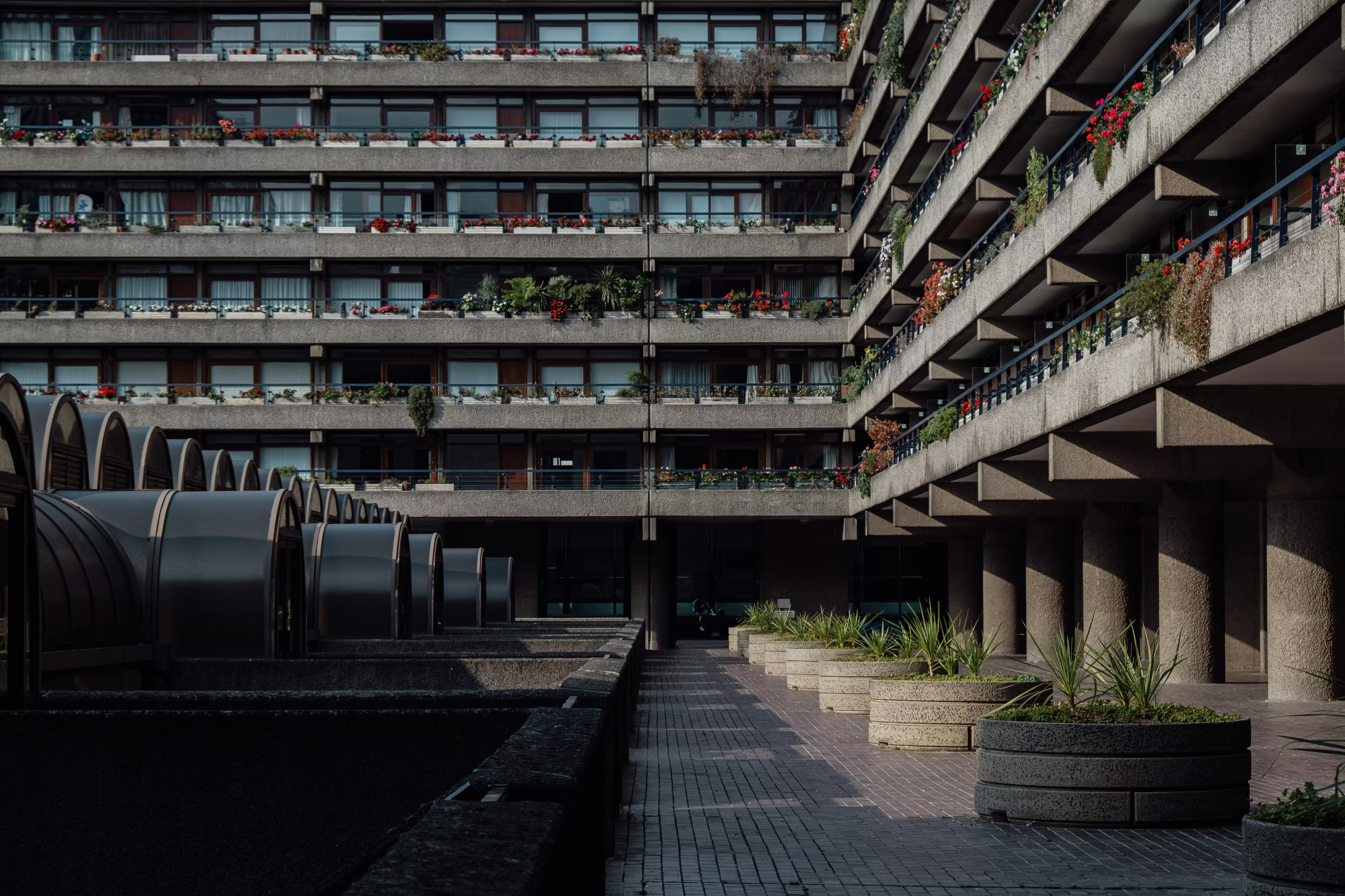
Brutalism originated as a style of architecture. It is, and has been for a long time, controversial, with public opinion seemingly worsening as of late. I think this poor reputation is unjustified, and can think of a number of reasons for it:
- the name might lead people to believe it is intentionally harsh/hostile/not meant to be enjoyed
-
it might be subliminally associated with Communism because of its
Eastern Europe prominence in the previous century
- obviously, a lot of effort has been put into propaganda convincing people this time and place was evil
-
specifically, it was used extensively for low-income housing, linking it
to two things that damage its image:
- public housing is rarely maintained well
- public housing is generally inhabited by the poor
- the Barbican Centre, pictured above, is a rare exception to these, and is very well-loved by its community
-
in the west, buildings with brutalist appearances tend to be things that
are inherently a bad vibe:
- prisons
- hospitals
- parking garages
- school campuses
- bureaucratic structures
Despite all this, I see beauty in brutalism. And while its aesthetic is distinct, it is very specific to architecture, so it is better to take inspiration from it in other disciplines of design through its underlying principles. I've spent a lot of time thinking about this, and have gradually built up a rough philosophy of brutalism, which I'd like to share here.
principles
The most distinctive trait of brutalist design is its honesty. The imposing concrete structures people think of when they hear brutalism, are importantly, raw concrete. It is not finished with a coat of paint, or excessively sanded for smoothness. In fact, the name of the movement comes from the French béton brut, for raw concrete. Leaving the poured walls with imprints of the forms that contained them would be sloppy or distracting by many standards, but is a defining characteristic of brutalism. "Truth to materials" is how this is usually summarized, and can easily be extended beyond architecture, and even beyond material considerations.
"Form follows function" is another widely accepted architectural aphorism that brutalism takes cues from, in a number of ways and across many functions. Buildings categorically should be durable and long-lasting. Sometimes, it may be desirable for them to be flexible or even modular to accomodate the needs of the future. And fundamentally, they are always built with a specific purpose in mind (eg. living, working, recovering). Fulfilling functionality is a baseline requirement for an acceptable product, but should really be the principal influence on a product's design.
Optimizing for capability sounds good in theory, but there is always more that can be done. The final pillar of brutalism is to rein this in by prioritizing efficiency. Every product has a purpose, but it also has a budget and timeline for its creation. It is no coincidence brutalism was Europe's aesthetic of choice in the aftermath of WWII, when quick and affordable construction was absolutely vital. This was a defining characteristic of brutalism, but the emphasis placed on it has declined. With technology and globalization making manufacturing fast, cheap and good enough for most, achieving any aesthetic can be efficent. As a result, brutalism has moved into a form of luxury, taking truth and utility as far as possible rather than trying to compete on price. My thoughts on this are still a bit fuzzy, but I still maintain that careful consideration for efficiency is important for any design.
The intersection of these principles gives new tenets to follow too. When you focus on efficiency & functionality while allowing yourself to be honest, products practically design themselves. The process of designing and consideration for the process of construction inform what the design ultimately ends up as. There is also a lot of overlap with Dieter Rams's Ten Principles of Good Design, most notably in designing products that are:
- honest
- useful
- long-lasting
- unobtrusive
- understandable
- thorough down to the last detail
- as minimally designed as possible
Some of these are not direct principles, but I hope it is apparent how they can arise from the foundation I've laid out. The exceptions are of good design being innovative, aesthetic and environmentally friendly. Innovation is great, but I would argue not constantly necessary, and in my mind brutalism is keen on drawing from standards and conventions. Consideration for the environment is not something I associate with brutalism per se, but it definitely is a requirement for good design most of the time. Regarding aesthetics, there is much to discuss. However, I'd like to avoid philosophizing about the nature of beauty, so I will simply state that while designing for external beauty is not a priority in brutalism, but it is often a natural consequence—contingent on one's capacity for appreciation.

The first brutalist building I spent significant time in. It got a lot of hate on campus for being too prison-like, but I quite enjoyed my time in and around it.
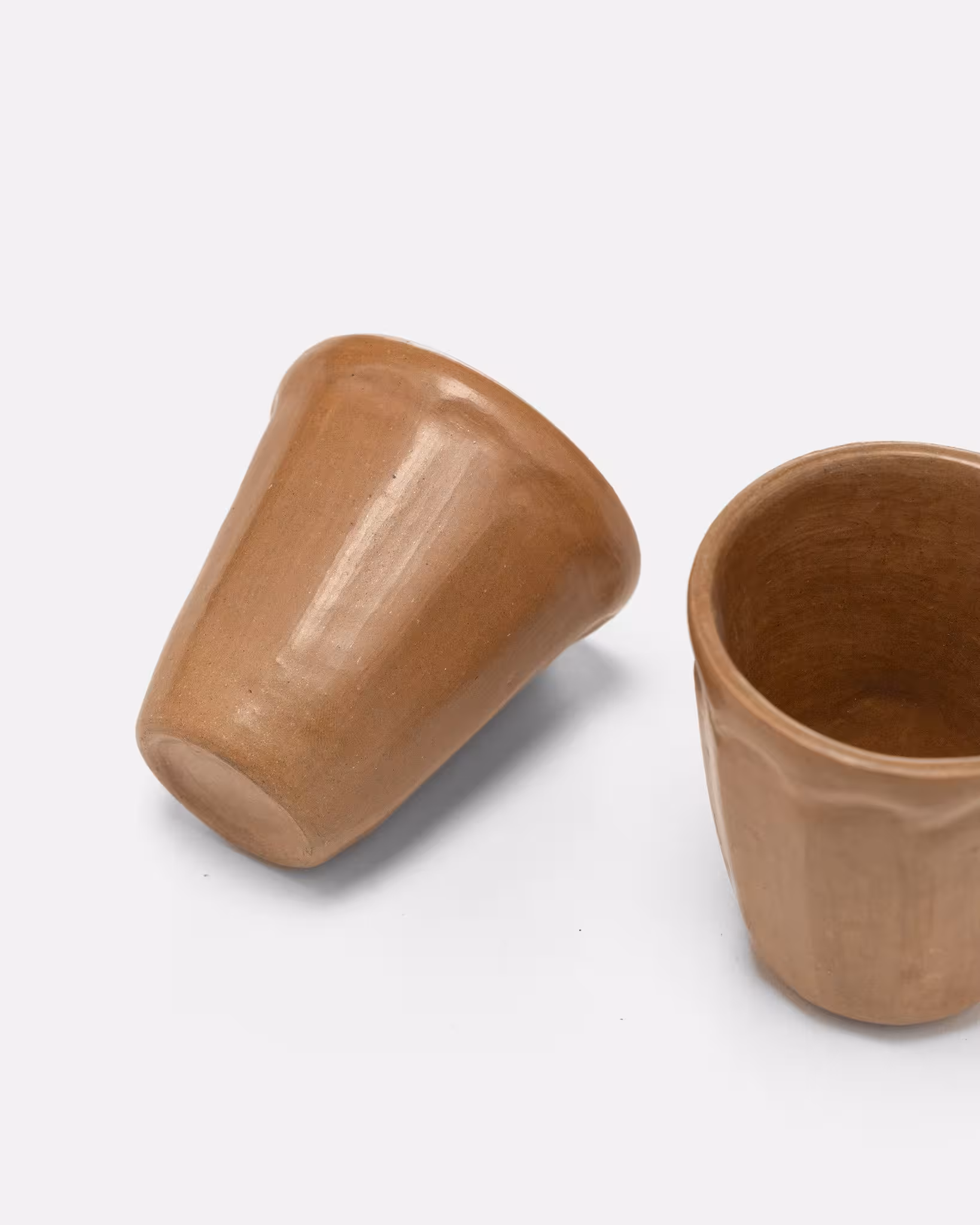
The Apapacho Espresso Cups are a handcrafted pair of espresso cups that merge traditional Mexican artistry with contemporary design. Created by Familia Bautista using hand-built techniques, each cup features an organic, sculptural shape and unique variations. The beeswax-coated clay showcases its natural tones while adding a subtle sheen, celebrating the material's origin. Perfect for elevating coffee rituals, these cups embody heritage and modernity in equal measure. Please note: due to the handmade nature of these items, every piece is unique. There will be slight variance in colour, shape and markings.
Brutalism doesn't have to be all about concrete. It's fun to live with a variety of materials, and clay is a very cool one, albeit a bit situational. These are a nice of way of bringing some in and highlighting its natural characteristics. Tender also makes some really compelling mugs (my favourite being the
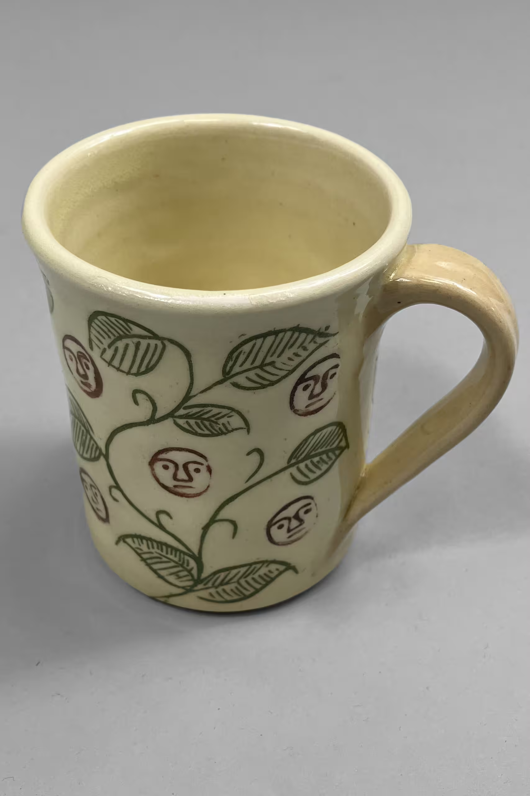 Plautus Vine Sgraffito On White Clay, though the less decorated ones are probably more brutalist), which are hand-thrown, left unglazed on the bottom, and made with local clay.
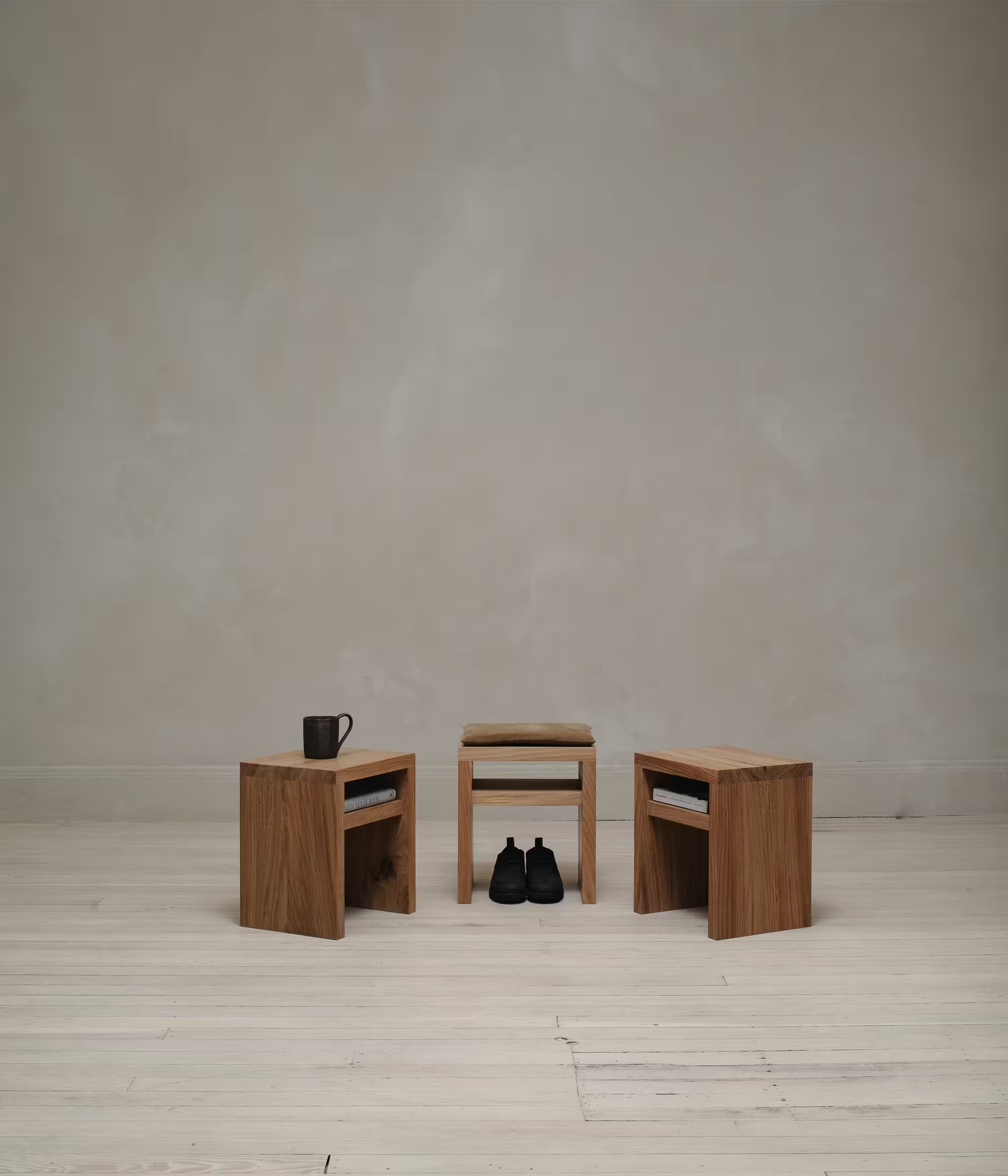
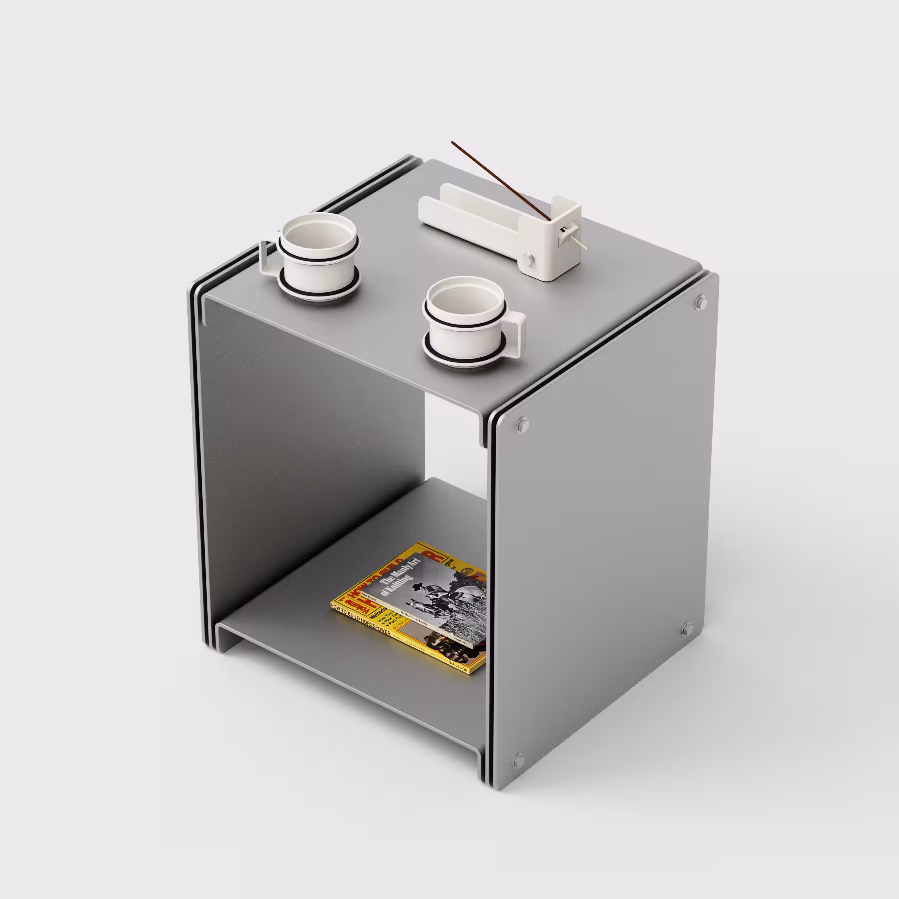
The Shelf Stool can serve as primary or auxiliary seating, a bedside table or plant stand. The optional cushion is made in our studio from undyed organic cotton (Foxfibre) corduroy with 100% wool fill.The natural oil finish seals and protects the wood - but it is suggested to use coasters, and to dust the surface with a slightly dampened towel. If stronger cleaning is necessary we can recommend a cleaner that will maintain the integrity of the oil finish. In the most extreme case, the wood can be sanded and the oil reapplied.
Each piece is made from locally sourced natural material. Wood settles over time and can react to changes in humidity and temperature - this can result in small checks or thin non-structural cracks. For the most part these changes are celebrated as the inherent expression and irregularity in the natural material.
I think wood is by far the best material for making furniture. Metal can come close though. Standard Equipment has some nice stuff in that vein, though most of it isn't exactly brutalist (I've seen it described as postmodern). The
 3075 Side Table is somewhat analagous to this evan kinori piece, especially in (what I think is) unfinished aluminum. The
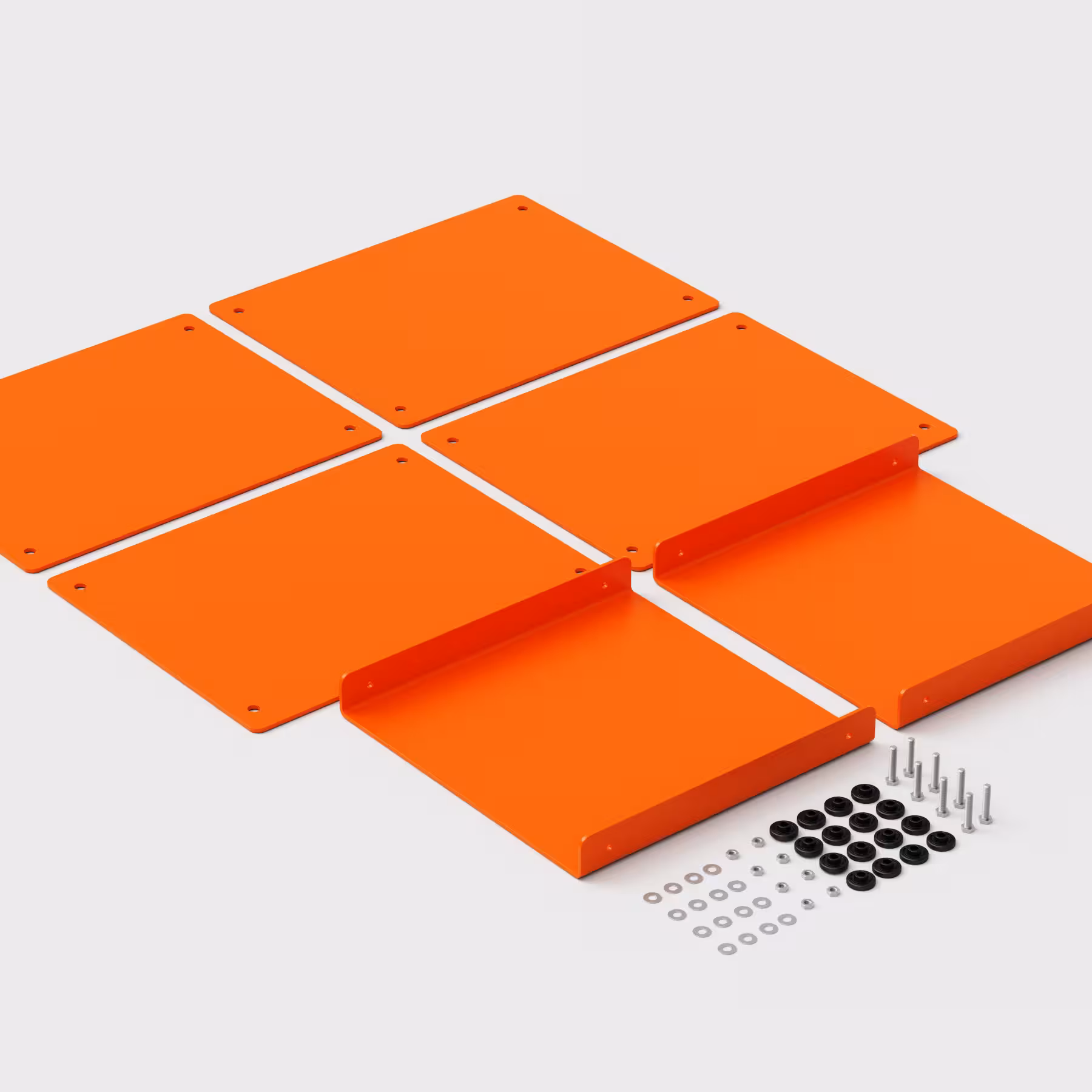 powder coated versions are also nice, but less aligned with brutalism.
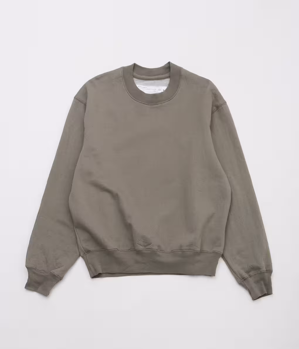
Custom-developed from soil-to-loom using luxurious, smooth Rambouillet wool (fluffy inner) and organic cotton (face), this brushed-backed fleece is uniquely light, buoyant, and cloud-like. Insulating but not overly warm or bulky, it's perfect for layering under a jacket and over a tee.The wool is sourced from Rambouillet sheep, raised using climate-beneficial practices located at the edge of the Great Basin high desert, straddling the California-Nevada border. The smooth, slightly puckered exterior is made from Organic Upland Cotton grown by T.O.C.M.C., a cooperative of organic farmers in South Plains, Texas.
After the raw cotton and wool are ginned, carded, washed, and combed, they are spun into yarns by small mills in North Carolina and Maine. The yarns are then knitted into fabric Quebec.
Around the same time I started pondering brutalism, I was becoming fairly interested in clothing. When I first tried melding the two, I thought of brands like A-COLD-WALL* and AFFXWRKS. This works on the surface, but I've since become interested in brands rooted in honesty, like the aforementioned evan kinori and Tender, mfpen (and its Scandinavian minimalism ilk), Jan Jan Van Essche, and sometimes stuff like Engineered Garments. Clothing is a great canvas for brutalism, with fabric being a perfect way to express truth to materials. Dana Lee Brown is unmatched in this regard (just look at any of the product pages). Minimal ornamentation is easy to do and see, but I'm not so knowledgable on tailoring, so brutalist clothing construction and functionality is still opaque to me (off vibes though, I think Tender might be on top for this).
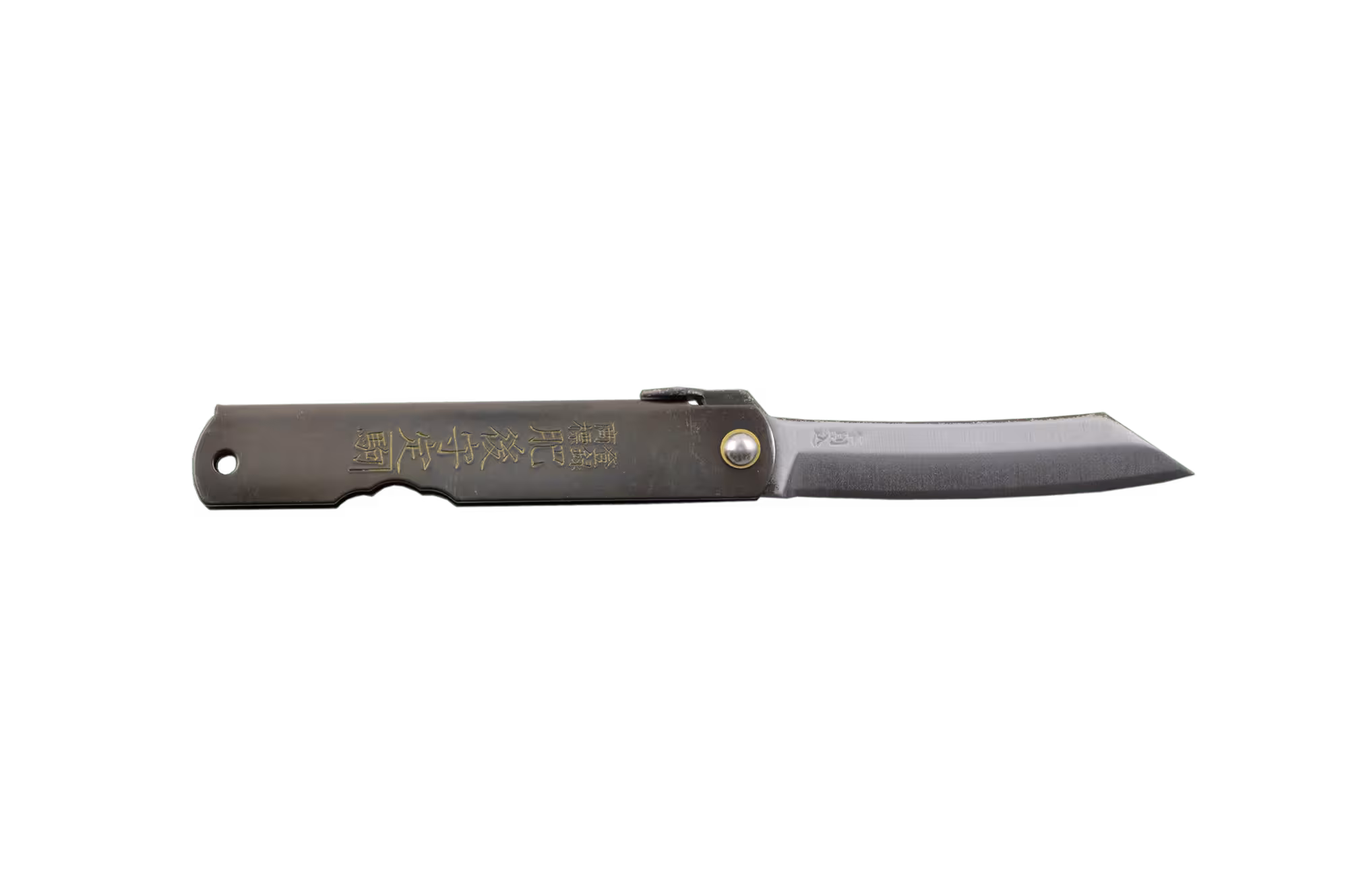
The Higonokami is Japan’s most iconic folding knife—renowned for its minimalism, durability, and practicality. Its finish embodies the raw, authentic spirit of Japanese tradition. Lightweight yet robust, it’s a trusted tool for outdoor activities and everyday tasks alike. Please note: Each knife is hand-forged, which means minor surface marks or scratches from the fabrication process are normal.
A rare relatively inexpensive thing on this list! I have a one of these in the small size (purchased from Knifewear) (my only knife by the way) and I love it. There are no fancy opening or locking mechanisms to fail, no obnoxious tactical styling, and no exotic alloys. Read here for more thorough appreciation.
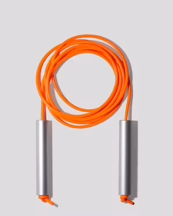
This jump rope was designed and built to be the last one you'll ever buy.
CW&T make a lot of cool things, all designed with consistent themes of longevity, utility, and repairability, and overall a tremendous amount of intentionality. Some of my other favourites include the
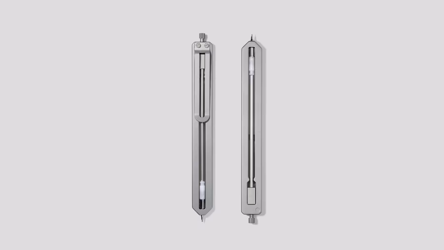 Pencil Type-C,
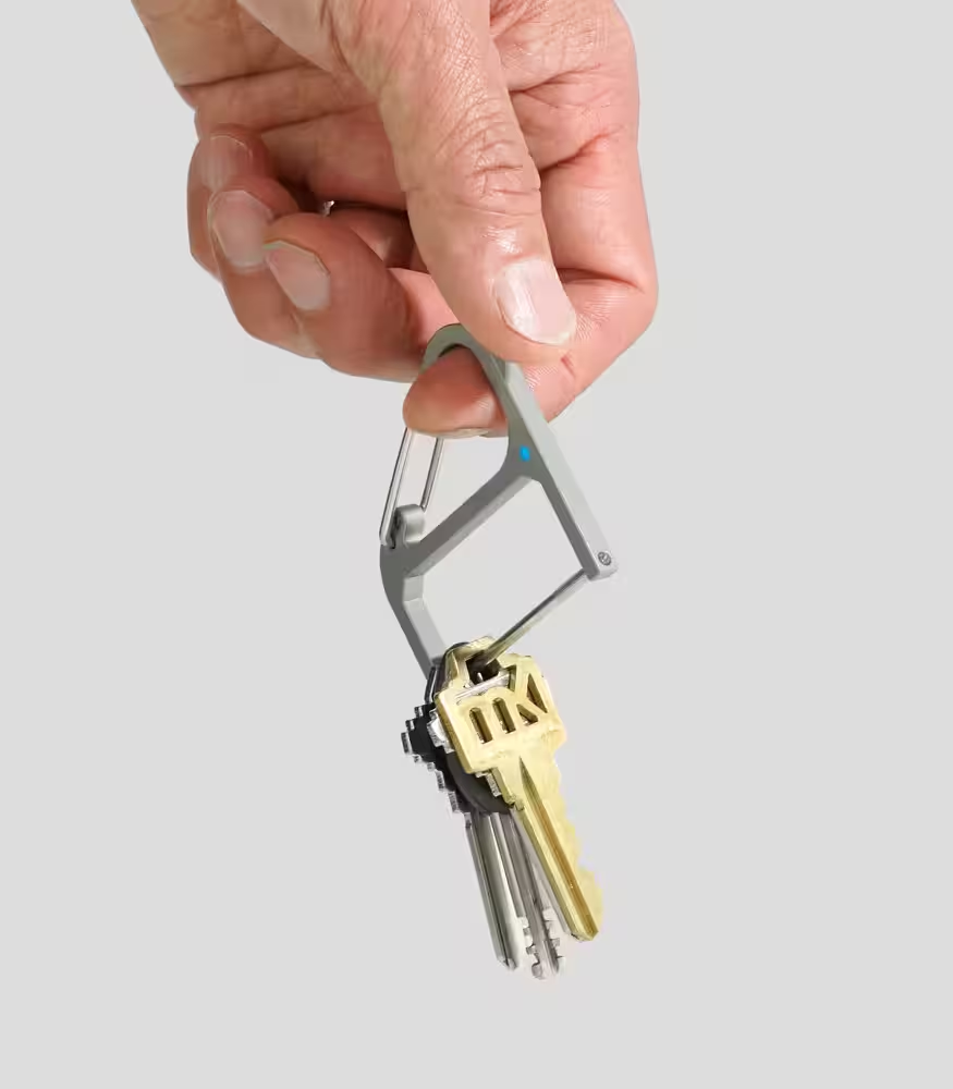 Key Wrangler, and their
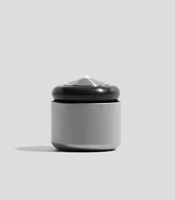 Acorn Flywheel Spin Top. They also have a neat
 sketchbook which is surprisingly similar to the next example.
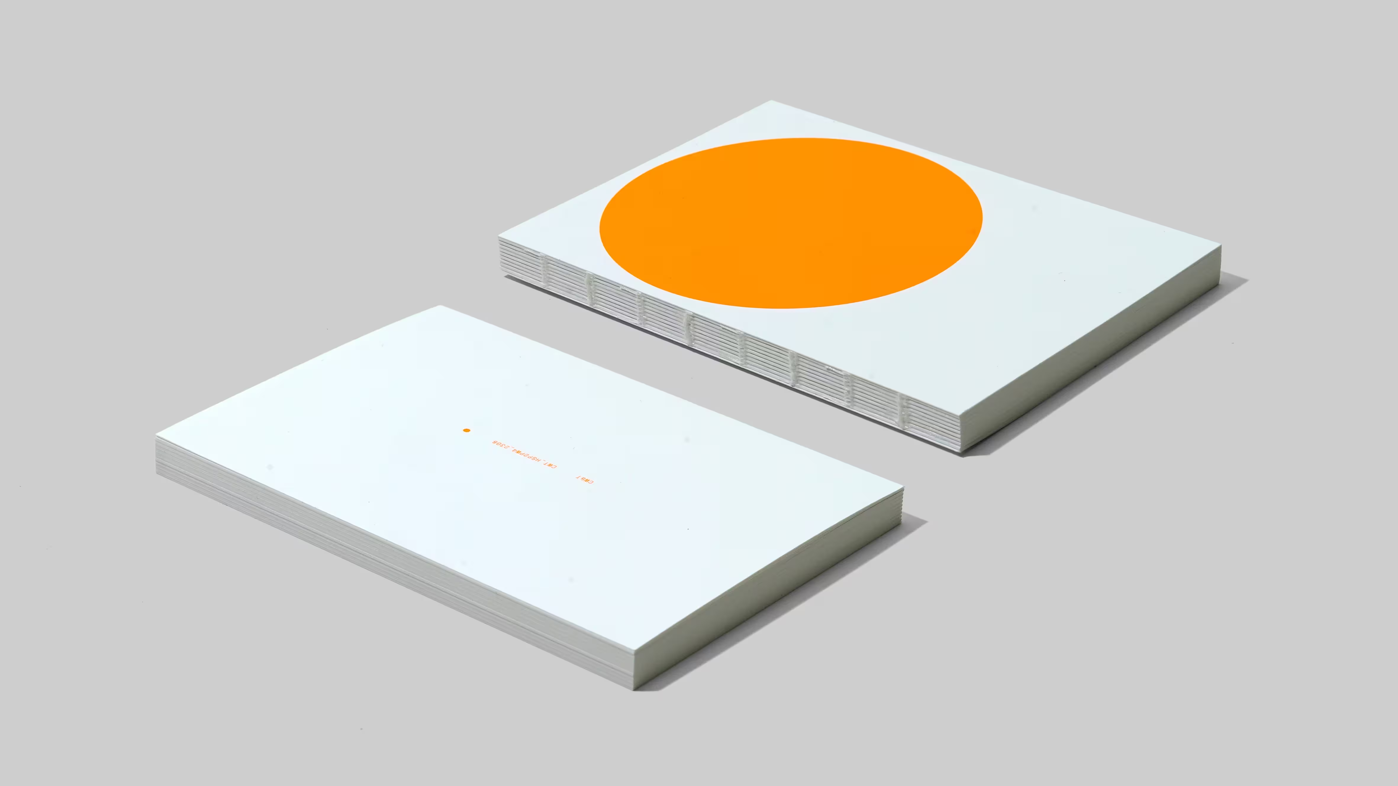
A simple notebook that is optimized to make writing easy.
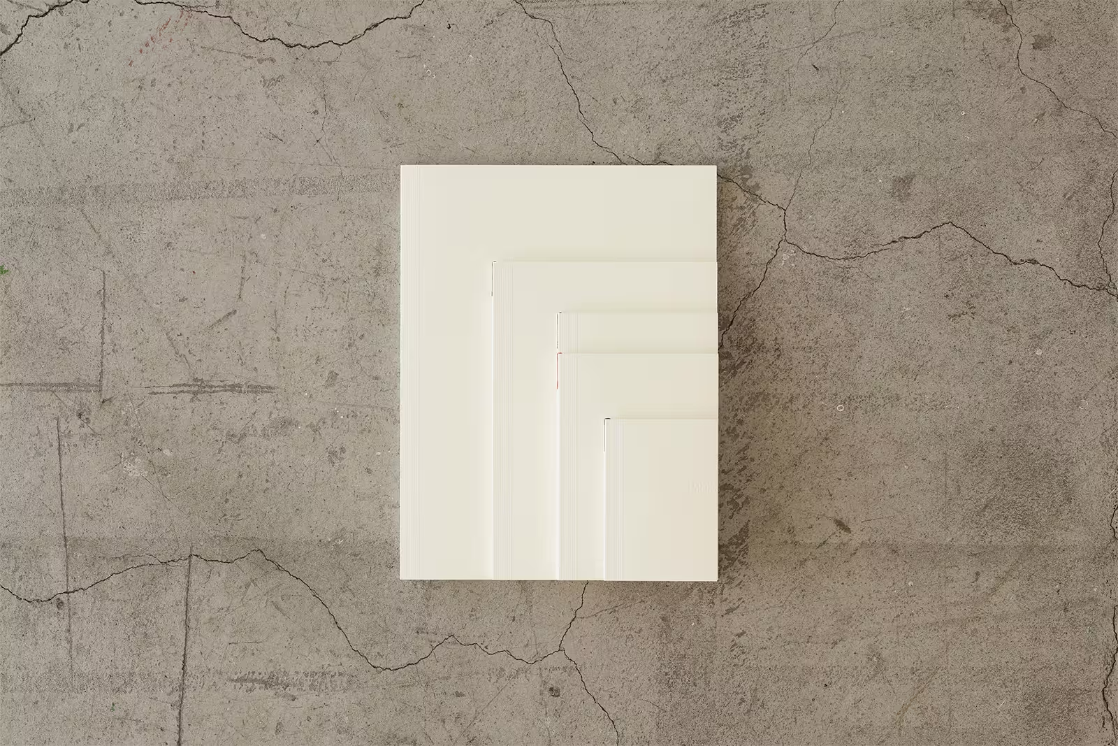
Note the concrete in the background! Perhaps a coincidence, but many of the brands listed here have raw concrete involved in the settings for their marketing materials, and I don't think this is a coincidence.
Anyways, this is currently my favourite notebook, with grid paper in the A5 size. I'd like to try A6 as well, but aside from that I don't see how anything can beat this. The smooth paper, (exposed!) construction allowing for it to lay flat on any page, and clean paper cover are my favourite parts. The ribbon is a cute touch, especially giving each iteration its own colour to distinguish them.
Brutalist writing instruments are a bit harder to pin down for me. At times, the cheap but considered ones feel right, like the
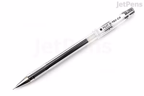 Pilot Hi-Tec C or
 Pentel Graphgear, but usually I find myself drifting towards luxury options like the
 LAMY 2000 variants,
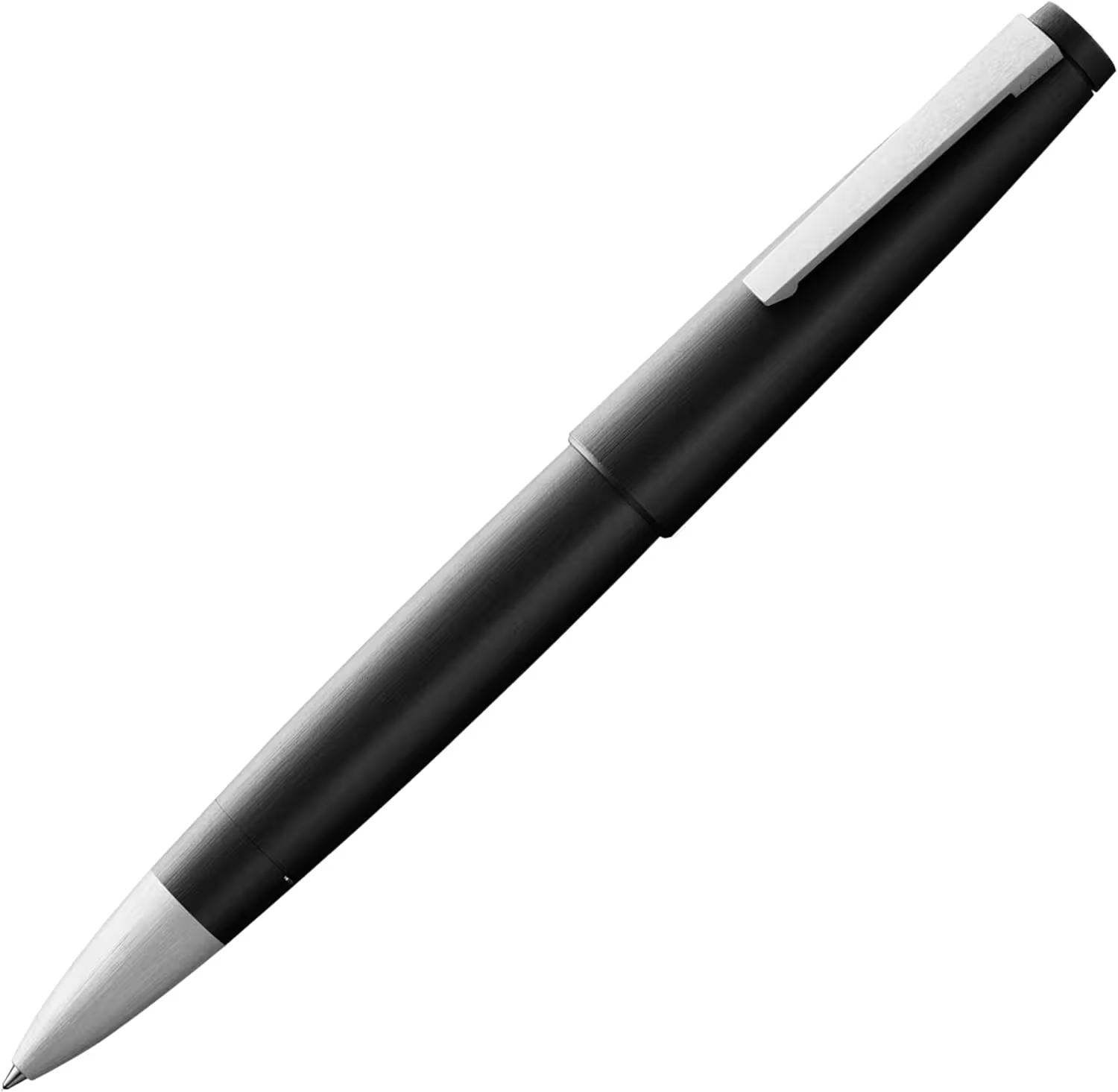
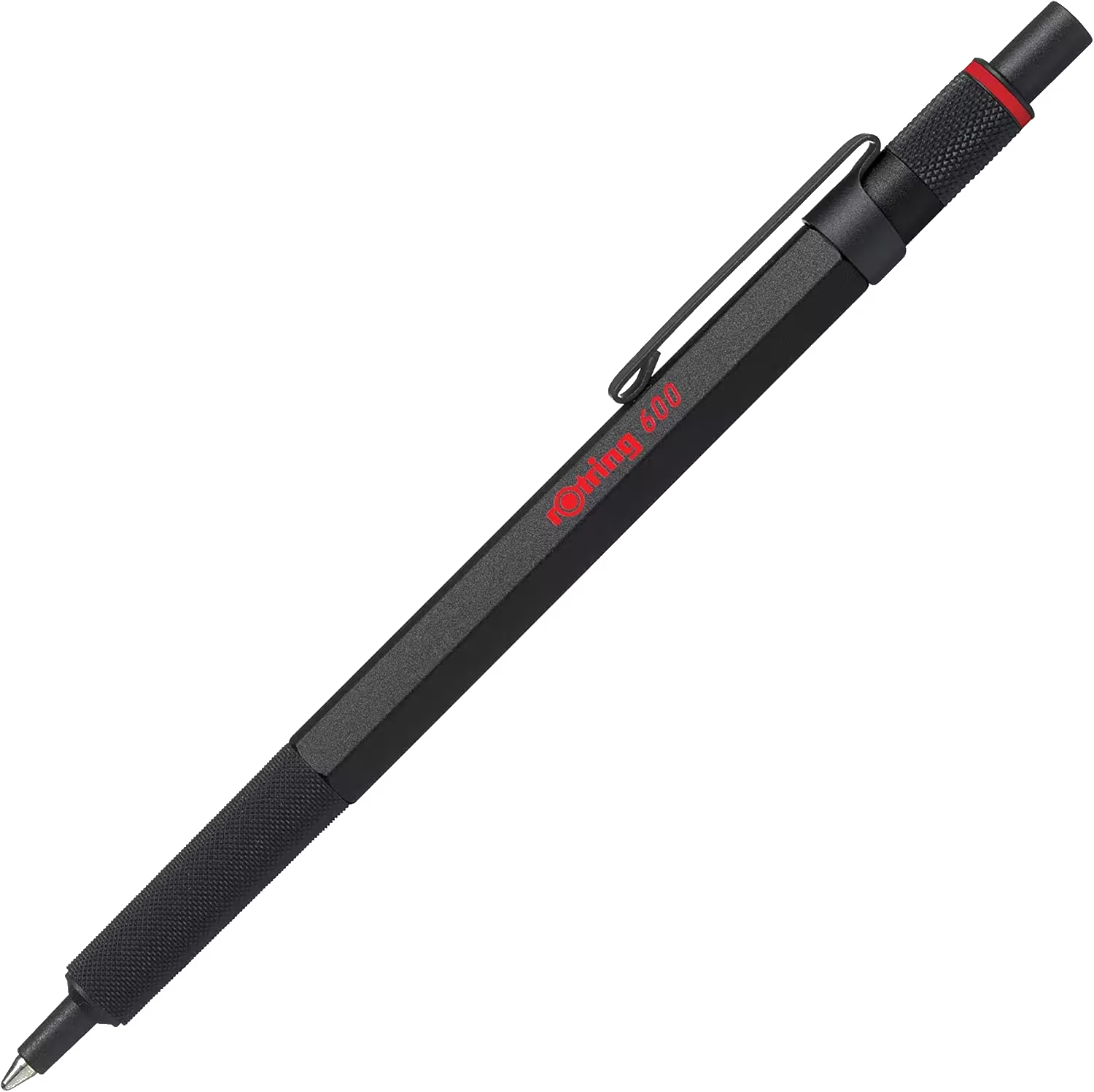 r0tring's lineup, or even the
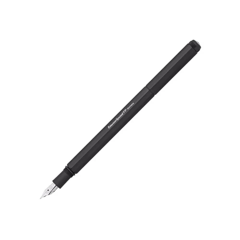 Kaweco Special Fountain Pen in Aluminum.
brutalist software
Ostensibly, brutalism and software are a strange pair, but their union is surprisingly well-discussed. I guess this trakcs though, since designing user interfaces is what inspired me to investigate the spirit of brutalism in the first place. A popular post pertaining to brutalist web design can be found at (no shit) brutalist-web.design. I don't agree with its precise definitions, but the guidelines are great, and got me thinking about how I would write the rules for user interfaces more generally (not just the web). To me, software being brutalist means
things are as they seem, and seem as they are
- seek semantic correctness. examples:
- if something functions as a button, it should look like a button.
- if something looks like an image, it should be an image
- should be able to right-click + open in new tab
- non-example: standardequipment.ca's pictures are actually empty divs styled with a background image in css
appearance and behaviour are consistent with the context
- internal consistency should go without saying, but the software should also fit in its environment
- follow convention, use the defaults, and build on/around them mindfully. examples:
- on web: don't hijack scrolling or the mouse pointer or the browser's back button.
- on macOS: shortcuts are consistent, eg. cmd + W closes the window. navigation with modifier keys works as expected. multiselection. and should fit in visually, since the platform is opinionated.
users are in charge, and treated optimistically
- let them use the software how they choose
- make common tasks quick and easy
- be open with APIs and protocols if possible, but at the minimum, don't impose unnecessary limitations
- allow for modifications when possible, both visual and functional.
- I am most interested in thinking/learning more about this one
being accessible by default
- follow accessibility standards (at least the easy ones)
- support hardware and software versions as far back as possible (don't explicity restrict old versions unless they would definitely have issues)
- be reasonably performant: accessibility means people should not be limited by the capability of their internet or GPU
- this is all by default, because there are applications whose complexity force them to be inaccessible in some ways